There has been a quiet revolution at Action Can HQ over the past few months.
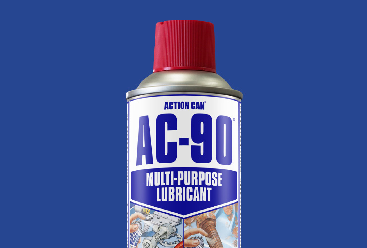
We’ve always loved our hand illustrated can designs, but we thought it was time for a little modernisation and refresh of the layout.
The product text has been improved to assist the end user with product identification. We have also added a ‘product feature zone’ below the illustrations, to further help communicate key product features and assist in correct product selection.
On the reverse of the can, we have doubled the number of languages from three to six, allowing international distributor sales, plus important safety information for non-English speakers.
The new look will be rolled out across the full Action Can range – so keep an eye out!


